Have an account?

Saturday, January 30, 2016

Blogger Love: Color Lust and Unexpected Trends


This week's edition of Blogger Love includes guides for wearing 2016's hottest hues. Lisa Walker of Independent Fashion Bloggers has this take on the latest roundup:

Colors, hues, and shades, oh my! In addition to the discussion of the 2016 Pantone colors and the who, what, where to wear them, shades of blush and black seem to have made it to the top of the honorary colors list. Now, perhaps it has to do with the upcoming Valentine’s Day holiday, but I was still loving all the color stories IFB bloggers were telling. Please continue to gear up for the holiday of love, and I’ll look forward to a few more love and color centric posts as the 14th of February nears.
Large or small, wardrobes can make or break getting ready for the day or a night out on the town. Read up on tips to building a capsule or classic wardrobe that will make you think twice the next time you are out shopping. Plus, reasons why and how to hold on to that leather coat. Also, a look back to a time before blogging, as well as services and point of views to consider in the business of blogging.
And proof that I must live under a rock surfaced when two fashion trends emerged that had yet to make it on my radar. Faux freckles and cape blazers. What?
Read more >>

Friday, January 29, 2016

Rita Vinieris Spring 2016


The New York Fashion Week shows at Moynihan stations are held in pitch-black tents. What a treat to enjoy a fashion show where the models walk in the sunshine! Rita Vinieris held a lovely lunchtime event on the rooftop of one of the Carnegie Hall buildings.

Guests sat civilized tables in proper chairs while they watched models parade through them for designer Rita Vinieris' debut eveningwear collection. Ironically, the theme of her Spring 2016 collection was called "Twilight".

This was not a season inspired by angsty vampires. Instead, the designer studied the juxtaposition of lightness into darkness with pops of solid colors. There was a mix of translucent and solid textured fabrics. Shades of grey, black and white were featured to examine gradients of light.

Other than the "Twilight" inspiration, the runways looks weren't put together to follow something trendy. The outfits were styled to be sexy and classically elegant. Dresses that would be appropriate for black tie galas year after year. Stylist Freddie Leiba had the models in slick, long, straight hair parted down the middle while keeping the lips in classic Hollywood red.

While the intellectual aspect of her inspiration may be lost on the casual viewer, the beauty of the gowns and silhouettes stands on its own. Each dress was designed to flatter the movement of the walking model. Whether it was the swish of the long sheer skirts or the leg-baring slim draped gowns, each look was styled to stun.

Rita Vinieris Spring 2016 fashion show was literally the fashion show for the ladies who lunched by providing lunch to those exact ladies. Perhaps that is the key for a rising designer to hit their target market. Feed them in their own environment!

Read more >>

Sunday, January 24, 2016

Carmen Marc Valvo Spring 2016


The runway was a parade of Eastern chic for Carmen Marc Valvo's spring 2016 collection. The color palette was a stark black and white with deep red as an accent color. There was a continuous theme of brushstrokes as a motif. It was in painterly prints but also echoed in the embroidery.

The designer used a mix of leather and python paired with delicate soft silks. When combined together into a longer gown, the effect was sexy and edgy on top, flowing into feminine and soft at the bottom. The bodice often had a sporty, sharp cut neckline or shoulder treatment while the skirts were full and sweeping.

When I worked for Carmen Marc Valvo as an intern wayyyy back in my Parsons School of Design days, there was a lot of beading, embellished cocktail dresses and gowns. There were fancy suits that appealed to a mother of the bride. This runway show has shown that his label has branched out into swimwear and menswear with the same level of luxury and design. Men's jackets had the painted prints. The swimsuits carried through the looks of the red carpet gown so you can continue the black tie aesthetic from pool to gala.


The inky prints included abstract brushstrokes to whooping crane paintings that looked like traditional sumi-e art. There were floral patterns in all size scales. They ranged from dainty floating flowers to giant blooms that read more like a painted texture.

For the makeup, however, the stylists opted for exaggerated slanted eye makeup, almost like an Asian cliche. I felt this was tacky and unnecessary to get the theme across. The clothing spoke for itself. The hair was slicked back and simple. The shoes were rather minimal with wide straps around the ankle and front foot.

Carmen Marc Valvo's spring 2016 collection was a pretty one. This is another designer I would love to see more of during awards season. The designers loyal fans would agree. I have met some longtime friends during my short internship at this label. I love a company that produces relationships as much as it does dresses.
Read more >>

Thursday, January 21, 2016

#TBT Fashion and Food Diary of 1994

nicole miller fashion

nyfw fashion sketch

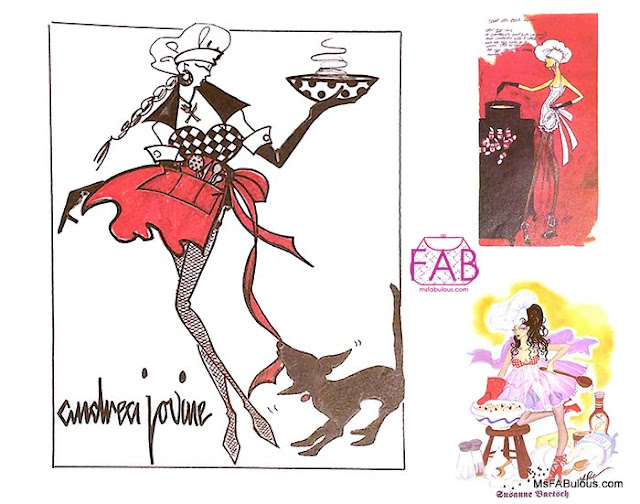
I recently unearthed my precious Fashion & Food Desk Diary published by DIFFA as a fundraising project. I loved this calendar. It was my first year studying fashion at Parsons School of Design and my second year living in NYC.

1994's Fashion and Food Desk Diary was the perfect time capsule of 90s Fashion

The calendar was beautifully printed with a collection of the contributions from the top fashion designers of that era. Between weekly entries were fashion sketches from different designers with a culinary theme.

NY Fashion Week was called 7th on 6th then. That year, it took place in April for Fall 1994. The  ones I attended included Nicole Miller, Todd Oldham, Norma Kamali, Prada, Anna Sui and Bradley Bayou. Some names in the calendar and that year's NYFW lineup are still going strong. Some are no longer in the spotlight like they once were, like Richard Tyler and Pamela Dennis. Some took a step back briefly and came back with a roar, like Nicole Miller and Byron Lars. Some have gone on to become mega-brands. Some, like Carlos Falchi, have sadly passed away.

byron lars sketch

What is amusing to me is looking back at my personal diary entries of that time in my life. It reads  like the perfect time capsule of a fashion ingenue cliche in NYC/Paris during the 1990s.

Using a mix of student discounts and Times Square TKTS booth, I went to see Broadway shows Kiss of the Spider Woman and Angels in America. I had dinner dates at Gotham Bar and Grill and Lucky Cheng's. I went clubbing at Tunnel(studios), The Limelight (now a mall) and Club USA. I had movie dates with boys or girlfriends at Priscilla Queen of the Desert and Interview with a Vampire. I attended exhibition openings at Exit Art and dressed up for Wigstock. 

At the beginning of the calendar, there are photos of many fashion icons looking young and fresh. The fashion sketches represent an era when designers still had the time and passion for creating full sketches in the industry. Now, fashion illustration seems to be a pastime of elite artists and bloggers. DIFFA (Design Industries for Fighting Aids) was more involved with fashion then while they are more famous for their Dining By Design events now.

The recipes contributed by the designers in the book (it was also about food after all) also show a more innocent time. There are multiple dessert recipes, pasta, polenta and pizza entries. This seems unusual now in today's carb-fearing fashion climate.

Well, I hope you enjoyed today's lookback into 90s fashion and a personal, somewhat embarrassing glimpse of my life as a new New Yorker. Enjoy the fashion illustration and the history lesson my friends.
Read more >>

Tuesday, January 19, 2016

Theia Spring 2016

tile print dress
theia ss16

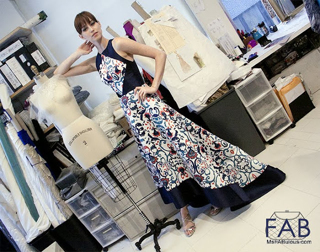
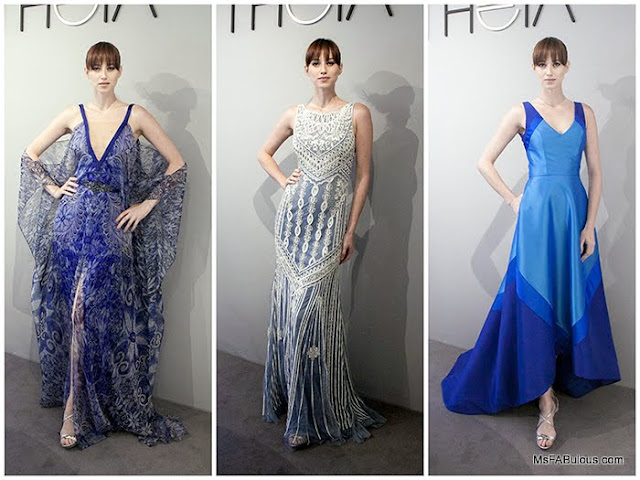
My favorite fashion collections are ones that offer some escapism. THEIA Spring 2016 took you away on a romantic trip to Granada Spain. Specifically, designer Don O'Neill looked to the UNESCO World heritage site of Alhambra.

The palace at Alhambra was once a fortress before being converted into the royal palace in 1333. It is remarkable for the Moorish architecture with Byzantine influences. As you can see from O'Neill's mood board, the palace has stunning architectural details and painted tiles. 

fashion sketches

You can see how the lacy carved stone entrances were interpreted in the embroidered lace gown above in the middle. All of the lovely painted tile patterns are incorporated into the digital prints on satin and chiffon. The rich blue and terra cotta colors along with Spanish sunshine have made their way into the overall color palette.

I am hoping to see more of these gowns on the red carpet of the ongoing awards season. My favorite Golden Globes dress came from THEIA already. I would love to see these patterns and sunny shades as an alternative to many of the predictable looks that celebrities usually wear. THEIA cuts to strategically flatter a woman's body with special details, so you can't go wrong. With THEIA spring 2016, you can be assured that you are surrounded by a palace. 
Read more >>

Sunday, January 17, 2016

Blogger Love: Daily Elegance

LALM_1.14.16
Lisa Walker from the Independent Fashion Blogger community curated this week's round-up of the best fashion posts. what content moved her the most:

One of the best themes posed by bloggers this go-round was to incorporate more elegance into our daily lives by wearing those special occasion wardrobe pieces that are usually hiding in the darkest parts of our closets. Why not dress up or down a glamorous suit? Why not wear sequins everyday? I asked a similar question recently, except it was rhinestones with a muumuu. That’s no typo for Miu Miu, I really mean muumuu.
While muumuus weren’t on any IFB bloggers trends to watch list, I can’t imagine why, there were many to consider. Colors of gray, rose quartz and serenity blue, and florals of various hues. And no matter the color, oversized long cardigan sweaters and long vests seem to be not just a new trend but the new essential.
Many also found themselves inspired by designers and brands they love. There was insight into a show for up-and-coming designers, on traveling to Montreal, must-haves in the business of blogging, and a most charming list of umbrellas.
And of course this week’s roundup would not have been complete without some mention of the Golden Globes his and hers red carpet fashion, and the life and style legacy of David Bowie.

Links à la Mode, January 14
Read more >>

Friday, January 15, 2016

Son Jung Wan Spring 2016

pantone rose quartz

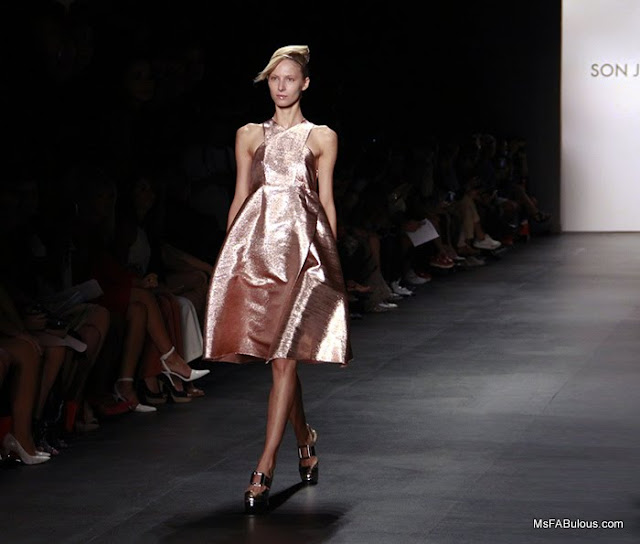
Korea's favorite designer Son Jung Wan was inspired by the "Gentle beauty of nature" for her New York Fashion Week show for spring 2016. Specifically, her muse was the gorgeous, volcanic island of Jeju in South Korea.

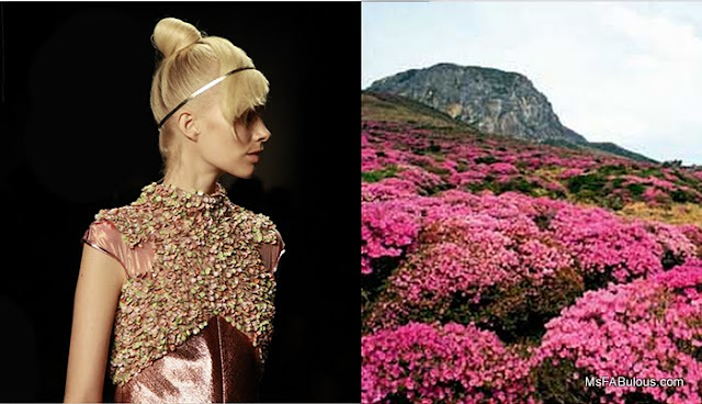
I couldn't immediately see the connection with the aquatic treasure and nature. The fabrics had pretty pastel and metallic finishes. The cuts were sleek and angled for many of the looks. I soon realized that the asymmetric silhouettes were more of an abstract reference to the volcanic structures on the land. I found some photos of the island that showed the delicate flowers that grow there. There were a few looks where the petal embroidery emulated that:

jeju island

The frosted pink shade and sharp cuts of both the long and short dresses that they were designed for perfectly embodied Pantone's Color of the Year of Rose Quartz. Deeper green and blue hues took their muse from the surrounding island sea and foliage.

While most of Son Jung Wan's fan base is in Korea, she is quickly gaining some famous fans Stateside. The star model of the runway was Ireland Baldwin while Gossip Girl's Kelly Rutherford ran up to give the designer a supportive hug in the finale.

I love how Son Jung Wan's collection always looks sophisticated and feminine without being girly. She can bring in the pastels and embellishments but executes them in a mature way so that grown-ups actually want to wear them. I don't know why that's such a surprise, I think I have had too many bad shopping trips in Asia where high-pitched salesgirls try to bombard me with too frilly bows and pink. Spring 2016 is for the lady, not the baby.

son jung wan fashion show
photos by Mariana Leung

Read more >>

Wednesday, January 13, 2016

Shoe Worship: Taiwan's Church of High Heels


Shopaholics and fashion fans love to joke about their devotion to their shoe collection. Apparently the congregation in the seaside town of Budai has taken this to heart. The glorious high heel shoe-shaped church is scheduled to open by Chinese New Year in early February.

The shoe church is already a tourist attraction, resembling a giant Cinderella fantasy in blue glass. The church was built to attract female members, making itself Instagram-worthy with love seats, fashionable decor and even sweet treats to entice women to join.

This isn't the first giant, fashion accessory-shaped building in Asia. Korea has the Simone Handbag Museum which is shaped like a purse. Unlike the church, it is a cultural institution that actually has handbags as their exhibit.

Does this church leader really think that this is all it takes to inspire women to religious faith? That might be shallow, but a giant shoe in Taiwan's Southwest Coast National Scenic area is great for traffic and possibly foreign income. Can stilettos bring you closer to God?

Photo from the Daily Mail UK

Read more >>

Monday, January 11, 2016

Top Golden Globes Trends From the Red Carpet

portia doubleday golden globes

The Golden Globes are the first BIG red carpet awards show for fashionphiles to geek out over. I loved seeing many new faces doing their dress twirl for the first time in a year where they will be doing it again and again.

There were distinct red carpet trends that could play out throughout 2016:

Metallic Mirrored Trophies
If looking like a shiny statuette isn't a hint to the awards voters, I don't know what is. There were several gown on the red carpet that where embroidered with stunning metallic textures. They could be mirrored like Mr. Robot's Portia Doubleday's dress from Naeem Khan or Jane Wu's figure-hugging dress from THEIA. Room's Brie Larson was the golden girl in Calvin Klein. All new faces (to me) on the awards show circuit. 

jenna tatum globes

Starry Night
If you read this blog, you already know of my background and passion for gorgeous embroidery. There were several gowns in dark blue hues that sparkled like the actress was enveloped in stars. Viola Davis took my breath away in her Marchesa gown. Mr. Robot's Carly Chaikin smoldered in designer Juan Carlos Obando's gown. Jenna Dewan-Tatum sashayed in Zuhair Murad. Ana de la Reguera was in Carolina Herrera while Julianne Moore was sexy as hell in sparkling Tom Ford.

jennifer lopez globes

Bananas:
At one point, I saw yellow gown after yellow gown. Was this a Tarzan promo? This is an incredibly tough color to wear, what commentators call "risky". Alas, for those who love a good red carpet disasters, they were disappointed. Each woman here looked gorgeous in the banana peel hue. Jennifer Lopez defying science in her Giambattista Valli dress, America Ferrara (not Gina Rodriguez as she corrected) wore Jenny Packham and Lola Kirke wore Monique Lhuillier.

lily james red carpet

White Nights:
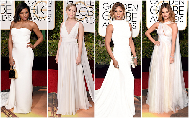
Celebrities used to shy away from wearing white on the red carpet because they feared it would look bridal. In 2016, white hot chic was the way to go. The bright, clean shade is striking in whatever silhouette the dress is cut in. It works in a tailored silhouette like Taraji P. Henson's Stella McCartney gown and Laverne Cox's Elizabeth Kennedy dress. White is equally dramatic in soft, draped looks. Saoirse Ronan wore a Goddess-like Couture gown from Yves Saint-Laurent. Lily James wore a dreamy Marchesa dress that actually had hints of pastel hues in the layers. 

So there you have it. If you have an awards show to attend, you have the top red carpet trends of the Golden Globes. Which one did you like best?

Photos by Jason Meritt/Getty, Jason Strauss/Getty
Read more >>

Monday, January 4, 2016

Easiest Nail Art Resolutions


I am a lazy nail artist. My adventures of creating masterpieces in nail polish, manicure nail art are contained in what I can accomplish during a good episode of Scandal or Empire. Still, I am happy to report that even the most simple of efforts on my part get a lot of compliments from fans who think I spend a lot more time than I do. My favorite trend this year as undoubtedly been the "negative space" look. Not only does this use less nail lacquer, it is much more forgiving when the mani grows out.

Here are my top techniques for lazy nail art:

The Stipple (top):
I use this look when I can't decide what colors to choose or have a general wardrobe palette I want to accommodate for awhile. You don't need a "nail dotting" tool. I use a bamboo cocktail pick. You can snip it to the size you want.

I start with a clear Sally Hansen Double Duty base coat then choose 3-4 colors, I then dip and dot on my nails, usually in an ombre or asymmetrical fashion. This leaves a large margin for error, just re-dot or reposition as needed. The color you want to dominate is applied last. Add a top coat and you're done.

Glitter Ombre:
This works with negative space nails or fully polished nails. This is great for people who aren't anal-retentive enough to make sure their nails are meticulously smooth and naked before they start. polish or base coat your nails. Then use your favorite glitter and smash lightly halfway up and apply heavily at the tip with extra coats the further up you go.

photos by Mariana Leung
The Chevron:
Another one for indecisive people. I take my two current favorite colors. I paint a diagonal swatch on one side of the nail, then finish with the other side in the second color, leaving a negative space triangle where your half moons are. Make sure you finish all nail art with a good top coat.

Funky French Mani:
Instead of a naturalistic white nail coat for the tips, I use bright colors or a double line of metallic and jewel tone colors. It might not follow the shape of the nail exactly, I might do a notch or drag the polish into a wavy patteI'mrn. As far as I am concerned, anything beyond a naked manicure is nail art (my minimalistic tendencies only go so far).


That FlashTat Mani:
This is the most 'difficult" nail art I attempted in 2015. I was obsessed with metallic jewelry tattoos from Miami Fashion Week Swim. I purchased many sheets of these and shared them with anyone who allowed me to apply them. I also used them as easy embellishments on my nbrails. I started with the base coat again and maybe a pop color across the white of the nail. I then stuck tiny motifs of jewelry tattoos in random patterns on my nail. I finished them off with good top coat.

There you have it. You have all of my nail art secrets. I love everything from glitter nail polish and metallics, to the richest hues known to man. I love Sally Hansen for glitter, OPI Nail Lacquer for the rich dark shades, butter LONDON for the bright summery ones.
Read more >>

Saturday, January 2, 2016

#2015bestnine: What Instagram Knows About You


If you on are on Instagram, Facebook or any of the social media apps, you have no doubt come across the #2015bestnine hashtag. The site creates a collage of your nine most popular images that you have posted based on engagement. So what does this data-curated collection of pics say about you?

Based on the images it pulled for me, I am clearly obsessed with fashion, the color red and pastries. Is that true? Well, as someone who has worked in fashion for over 20 years, live to shop and love any stylish cultural event, yes. The color red? I have had red walls in my last two apartments, various shades of it permeate everything in my home decor and all over my wardrobe. Baked goods? I am relieved this only occupies one photo of the nine. Yes, I love those too, but in 2016 they will be taking a smaller role in my life as part of my healthy resolutions. 

The photos are pulled by quantity of likes though, so it's not necessarily about what I like, but what others respond to right? Well, I would like to think that whatever you are truly passionate about comes through in your photography and people who follow you can see that. As a photographer, I love a saucy pose and dramatic flip of a dress. As a designer, I love color and texture. I think the photos above definitely demonstrate that and since they are the most popular pics, I'm not the only fan. 

Five of the photos were shot directly off a runway from NY Fashion Week. One is a personal style #OOTD look during fashion week, another is a fashion museum exhibit, and another is a fashion design display at a museum-like boutique. Damn, I'm predictable. Eight of nine photos were taken in NYC, the pastry photo taken in San Francisco. Weirdly, that pretty much sums up my geographical whereabouts in 2015 as well. 

The one thing that this collection did not show is my love of family. I don't post too many images of them on public accounts. When I do, I rarely add hashtags because they are for me, and not something I promote heavily, so they don't get as many engagements. It has been an emotional roller coaster of a year as far as they have been concerned. I have been lucky to spent some quality time with many of them, even if it was in small doses. Many have visited me in NYC, while I visited others in the North or West. Others I hope to see soon in 2016.

So now that I have pseudo-analyzed my own, timely gimmick posts. What did your own results say about you? Has Facebook's memories made you tear up? Your best nine Instagram images match capture your 2015? Let's get ready to make amazing content for the New Year!
xoxo,
Mariana 
Read more >>
Site Meter